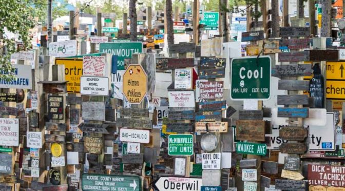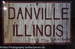
In 1942, while working on the Alaska Highway, a lonesome, homesick soldier named Private Carl K. Lindley attached his home town sign of Danville, Illinois to the directional post at Watson Lake.
Thus began the tradition of posting home town signs in the world famous Signpost Forest. Now, there are over 82,000 signs installed. You can read a more detailed account in the Watson Lake website.
I took a month off to drive to the Yukon with my wife this summer and when I stopped at Watson Lake, I wanted to create an iconic photograph that would show both the size and variety of signs in the forest. Because it was late and I was decidedly tired after a nine-hour drive from Fort Nelson, British Columbia, I shot in (gasp!) program mode. Between the two of us, my wife and I shot 101 photographs of the signpost forest.
The forest consists of hundreds of 6×6″ posts covered in thousands of signs, spread throughout a grove of trees spread over two or three acres of land. An aerial shot wouldn’t do it justice, and I don’t have a drone anyway.
As you walk through the forest, you tend to focus on place names you know, or interesting places from afar.
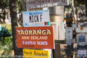
At first, the furthest ones I noticed were either in Europe at about 7,000 km, and then I ran into Tauranga, New Zealand at 14,050 kilometres.
People come a long way to hang an artifact on a post.
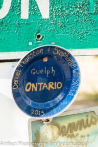
Some were very creative, such as an enameled camping plate with the location painted on it.
Others made me wonder how many towns and cities are missing crucial road signage.
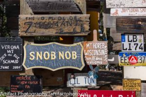
Still others attracted my attention with their weird names. I’d love to know the background on places like “Snob Nob” or “Cool”.
Some people grab their license plates and nail them up.
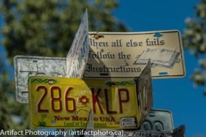
This all goes to show the extent of the problem of making a definitive image to show the size and variety of the collection.
I decided that a single shot of the entire collection was out of the question. I also decided that a shot of a small group of signs didn’t quite give the impression of the size of the site. I found three shots that show the layers of signs on display.
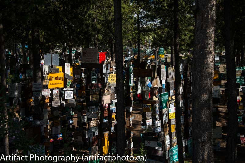
Signpost forest through the trees has a lot of mystery and depth to it and it keeps drawing me to it, but I just think it’s too dark.
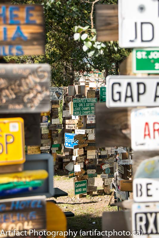
Gap really shows the layers and different types of signs, but it doesn’t show any particular sign. There’s no focus.
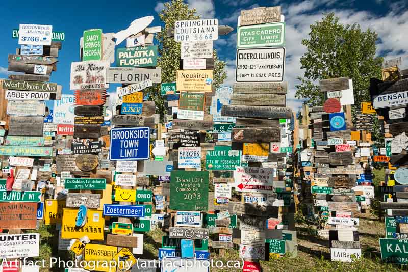
I love the deep blue sky in Springhill Louisiana, and the eclectic nature of the signs, but it looks a bit too much like other pictures of the site.
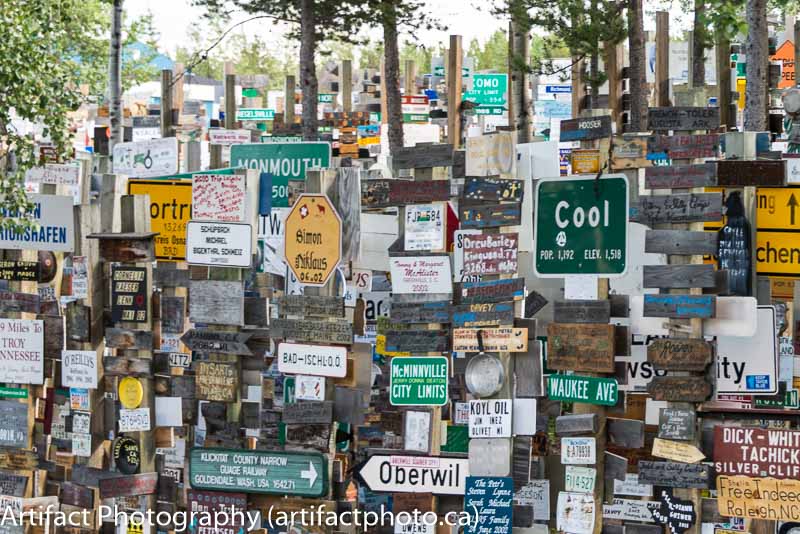
I like this Cool, California. It’s from a high enough viewpoint to see multiple rows of posts, is cluttered enough to show a wide variety of sign types. I would like the sky to be bluer.
Tell me what you think in the comments. I’d love to get your opinion.
This blog is published every Monday at 9:00 am, Eastern Standard Time. If you have comments, questions, or can think of a better approach, feel free to leave a comment. I’ll try to get back to you with a pithy answer.
Feel free to explore the rest of the Artifact Photography (a division of 1350286 Ontario Inc.) website at www.artifactphoto.ca
