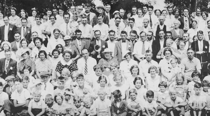
Back in the first half of the 20th century, when people tended to get a job with a company and stay there until they retired, businesses used to commission panoramic photographs of their employees. Copies of these photographs would grace the head office walls, be given to each employee, and even used in annual reports. Often, the employees would frame them and put them in a place of honour for a while. Others, I suspect, would look at them and think “This is pretty nice. Someday I’ll get a frame for this.” And then they would place them on a shelf under some stuff until someone would find them a few decades later and think, “This is an heirloom! I should protect this.” And then they would roll it up and stuff it into a liquor bottle container. If you ever get the notion to do this, don’t. It’s evil. Documents should be stored flat.
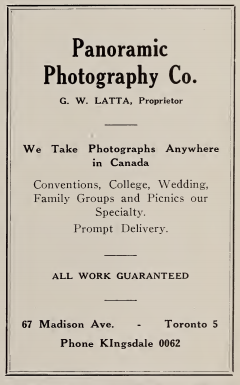
This particular specimen is photograph 4338, taken by the Panoramic Photography Co., of 67 Madison Ave., Toronto. They were known for doing a great number of panoramic group photographs in the 1930s and ’40s. I found this advertisement for them at Archive.org
Atlas Steels was a major steel company in Welland, Ontario. They held an annual company picnic from 1933 until at least 1988 in Port Dalhousie and later at Crystal Beach in Fort Erie. After Crystal Beach closed, I personally don’t know if they held them somewhere else until the factory closed in the 1990s.
In last week’s blog, I explained how to re-hydrate a dried up, rolled up photograph. This week, I’ll explain how to take a photograph of it so you can make a big print, decide to frame it some day, and roll it up until that day comes. Or you can put it on the Internet so other people can make guesses as to which of their relatives is in the photograph. My nine year old mother is likely in this one, as well as her father and mother. Somewhere. Also, my wife’s grandfather is also somewhere in there. Someday, I’ll see if facial recognition software will be able to assist.
Anyway, the document is flat, the books have been removed, but it still has a tendency to roll up. There are three ways to deal with this:
- You can place a chunk of glass on it. I don’t have optical glass large enough to do the trick. Non-optical glass may introduce distortions. And then there’s the problem of reflections. I’d rather not.
- You can place it on a vacuum easel. Oddly enough, I actually have one, but it’s only 16″ square and my original is 36″ long. They aren’t terribly difficult to make, but at the moment I don’t have time. Since I will be doing a number of odd sized documents this year, I’ll probably make one in the not-too-distant future. And I’ll do a blog on it, of course.
- You can place weights on it at the ends and other points that stick up. I went with this option, due to a time constraint.
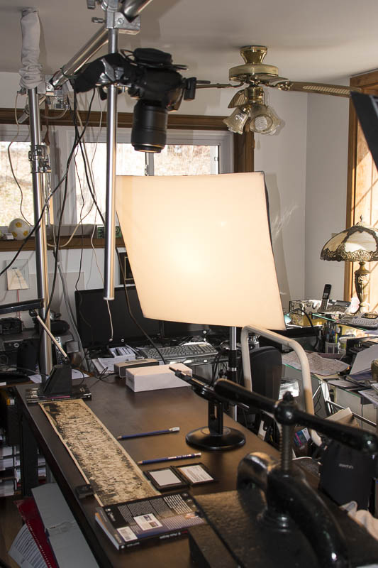
So, my first step is to lay the original out on my workbench facing up, directly under my camera support rail. My camera is mounted on a rail facing down, about 39″ from the table. If you don’t happen to have this kind of a setup, you can put the original on a plywood slab on an easel or on the floor and tilt your camera on its tripod to match the angle. This eliminates much of the keystone effect. If you put the document flat on the floor (clean the floor first, and keep pets, children and your big feet away) and angle your tripod head so it points straight down through its legs, you get the same effect, and like me, you get to use gravity to hold it down.
Put weights (books) on each end, just out of the frame, and smaller (low-profile) weights on strategic points along the long edges to keep them flat-ish.
The strobes were balanced to equal power, and located at about 45 degrees to the original, and roughly 45 degrees in height from the table top. I used soft boxes to even out the light.
I put books on each end of the original to keep it from rolling up, and a couple of small weights to hold down a trouble spot. As usual, I used a small aperture to give me maximum depth of field.
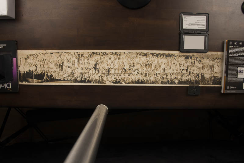

The entire original can be shot in one take, using a 28mm lens, however, there is distortion and the image cannot be magnified much. Note the silver tube in the centre of the shot. It’s the support for the camera to extend down from the rail.
I used a pair of pencils to keep track of how far down the photograph I needed to move the camera to keep just enough image overlap to allow the stitching software to tie it back together again.
Below, you can see the four photographs that together make up the finished product.
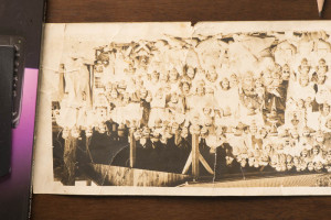
Note the weight (book) and pencil.

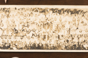
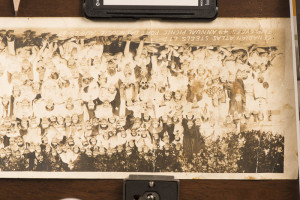
The pencil hasn’t moved.
The pencil has now been moved.
And again, the pencil marks the overlap. The grey card is there for colour balance. See my blog from February 1, 2016 – Getting Colour Correct.
My next trick is putting it back together. I’ll show how to do it both within Lightroom, and within Photoshop. Either way, it’s pretty painless.
Lightroom
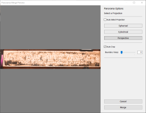
Once you’ve imported the individual photographs into Lightroom, you select all four and under Photo–>Photo Merge–>Panorama, you will find Lightroom will create a preview of what it will look like. You can try Spherical, Cylindrical, and Perspective projections. I found Perspective worked best.
When it’s generated the composite panorama, select it, and chose the Develop tab in Lightroom.

I set the white balance using the fragment of gray card in the original photograph. I switched to black and white because I liked it better. I found the sepia tone shows the age and dirt more. Black and white put the interest back into the people in the portrait.
Using the histogram, I found the exposure was about a stop too bright. I also dropped the whites slightly and enhanced the blacks even more. I goosed up the clarity to +36 which gave better separation between each person in the photograph. I also flipped it vertically and horizontally because the camera was upside down to the photograph. Oops!
Photoshop
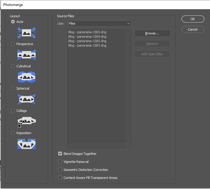
Similar to Lightroom, you start by selecting all four images in Lightroom, and right click, selecting Edit In–>Merge to Panorama in Photoshop.
The Photomerge window will come up. I left it on automatic. It probably went with Perspective Layout. I wandered off for a while and when I came back it was done (my computer’s a little long in the tooth).

One of the cool things about Photoshop is the various filters you can apply. To covert to black and white, you can be specific to which degree specific colours will be used to create black and white imagery. I nudged the reds slightly, but I found the best results came with dropping the yellows to -55.

I also increased the contrast with the Brightness/Contrast filters.
There were a few creases and cracks in the original from its being unrolled improperly over time, but these defects don’t detract greatly from the photograph.
Either method produces an almost identical panorama. I prefer the Photoshop method because of the fine control in the Black and White filter. The Lightroom image was easier to make, but only slightly.

Employees 4th Annual Picnic – Aug 28, 1937
This blog is published every Monday at 9:00 am, Eastern Standard Time. If you have comments, questions, or can think of a better approach, feel free to leave a comment. I’ll try to get back to you with a pithy answer.
Feel free to explore the rest of the Artifact Photography (a division of 1350286 Ontario Inc.) website at www.artifactphoto.ca
