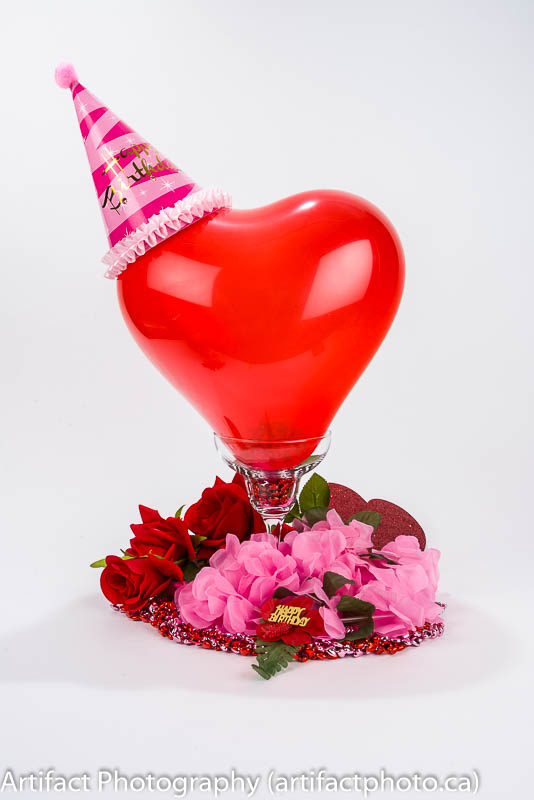
My Mom’s birthday is around Valentines Day, so naturally, Valentines is the typical theme for the poster I create for her party at her retirement home each year. Every year I create a new, custom photograph to use as the background for three sizes of poster. The primary is a 17” x 22” poster, which is mounted at the door of the room where her party is held, and two 8” x 10” posters for notice boards in the lobby areas of the building. 70 4” x 6” copies are made to hand to each resident.
This year, I wanted to photograph an image using balloons. I originally thought I’d just do closeup of red and white balloons on a white backdrop.
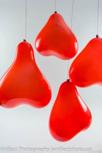
Then I found a bag of heart-shaped balloons. I didn’t have any handy helium, so I hung the air-filled balloons from my lighting grid and rotated the images 180 degrees so they’d look right side up. I positioned the strobes behind the balloons so they’d light up prettily. The annoying thing about heart shaped balloons is they rotate on the strings, so they’re rarely in the position where they look like hearts when you photograph them, especially when there are more than one of them. I tried poking them quickly so they’d spin in sequence while I shot them. Not a good look.
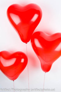
I then tried reclining the backdrop and leaning the balloons against it. Unfortunately, the light bled through the balloons onto the backdrop. I really didn’t like the look.
My next try would have been to lean the balloons against a six foot sheet of glass a couple of feet from the backdrop. That way I could illuminate the balloons from the back with no bleed through to the backdrop. But I used one of the test shots with the foreground text of the poster and although it looked okay, it didn’t knock my socks off. So I scrapped the concept.
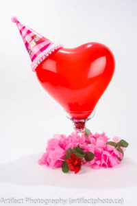
I went with a nice still-life setup based on a single balloon wearing a party hat, balanced in a daiquiri glass. First problem: the hat kept pulling the balloon out of the glass. We filled the balloon with popcorn kernels before inflating it (I would have used cinnamon hearts if I’d had any, just to give it a subtle Valentines look). I then taped the party hat to the balloon — the chin strap didn’t look at all pleasant. To hide the nipple under the balloon, a cheap necklace was coiled in the glass.
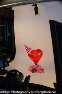
The balloon was lit mainly from the sides and front with two studio strobes, and a Nikon Speedlight was hung from the lighting grid to backlight the balloon and cast a nice highlight across the upper curves. Unfortunately the highlights on the cone-shaped hat somewhat obscured the “Happy Birthday” message. My wife fixed that by reinforcing it with a “Happy Birthday” prop on the red flower on the front of the glass.
In all, it took about three hours of fiddling around with the props to make the final image. The image was given the usual colour processing, except the whites were goosed up to +40 to further isolate the subject from the background.
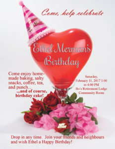
The result is a nice, attractive piece with plenty of white space for the text to be displayed without greatly cluttering up the image. Half an hour in InDesign put the rest of the poster together and then the printers started pumping out the three sizes of output.
This blog is published the last Monday of the month, at 9:00 am, Eastern Standard Time. If you have comments, questions, or can think of a better approach, feel free to leave a comment. I’ll try to get back to you with a pithy answer.
Feel free to explore the rest of the Artifact Photography (a division of 1350286 Ontario Inc.) website at www.artifactphoto.ca
