My mom’s birthday is near Valentines Day, which makes her party always a Valentines theme. Every year, to build anticipation for what will be an event to remember, we create a 17×22” poster, which is hung in a outside the common room for all to see for a week before the event. We drop this off a week or two before the date. It’s a big deal, with a buffet table full of desserts and games with prizes, all decorated with the Valentines theme.
Visual Identity
The party is given its own visual identity with table cards to identify the foods on the buffet table, each printed with the base image from the poster. In fact, everything to do with the party uses the poster image.
The poster is also produced as 60 postcard sized invitations which are distributed to each member of her retirement home, and a couple of 8×10” sized posters for the staff of her retirement home to put on their bulletin boards. There are even menus on each table during the event, showing what is available on the buffet table (elderly people prefer to be served).
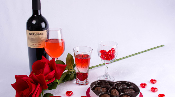
The critical component of this visual identity is a custom photograph which will look attractive on its own, as well as provide clear spaces for text.
The poster image
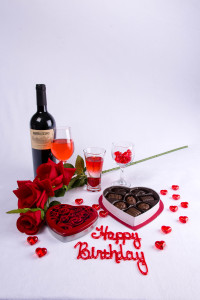
When creating images for posters (or in this case for multiple uses), it is useful to know what text will be added to the image to make the posters and other items. I don’t need to know exactly what those words will be, but I do need to know where to block out space for text boxes. For instance in my posters there is always a large block of text at the top announcing the party. There’s a block of text somewhere in the middle to attract interest, and another to announce where and when the event will happen. Finally, there will be more text somewhere near the bottom to reassure people that they, personally, are invited, as opposed to some other group of people.
Now that I know the primary blocks of empty space I’m going to need, I can apply that knowledge as I design the artwork.
This is the hard part. What to photograph? For inspiration, you can wander into your local crafts superstore, but I usually don’t find much there to fire my imagination. Where I get the most success is at whatever they call the local everything for a dollar(-ish) store. For a low price you can buy stuff to experiment with, because you need a goodly selection and don’t need to feel compelled to use things just because you overspent on them. In this case, because it’s for Valentines Day, there’s a huge selection of themed items. Another useful (but more expensive) place would be the local party supply store. In any case, with a pile of supplies in hand, I can now return to my lair (otherwise known as my studio) and play.
It’s a poster, so naturally, I’ll photograph it vertically (portrait). You may have noticed my signature style tends toward a black background, but because this is for a happy event, white makes a logical choice. Because it’s Valentines day, red would also be a logical choice, but because most valentines themed items are also red, contrast becomes an issue, especially when the audience is highly likely to have visually impaired members. So white works. If you don’t happen to have white seamless paper you can use a heavy fabric of some sort. I bought a bolt of heavy white material at a fabric store last summer and it works just fine. If you use fabric, iron it before setting up your tableau.
“Why seamless?”, you may ask. Because a line running horizontally across your image is distracting, no matter how faint. And it just doesn’t look professional.
I normally like to have a visual interest on the left side, bringing height and scale to the image, such as a wine bottle. “Why the left?”, you may ask. Pop psychology might say, “because as English readers, we’ve been trained to start on the left and read down, so our eyes naturally fall to the left.” My take is it just looks better. I also happen to know that on all the forms I’m going to use this the image is always on the left and the writing is on the right. If, for instance, on the table cards, the text for “Raspberry Pinwheels” (yum!)overlaps the image, it won’t be a problem.
Incidentally, because I knew I’d be writing about this, I got permission from my favorite winery to show their label.
Design decisions
So, the decisions went like this:
We start with the wine. And if you have a wine bottle, perhaps a wine glass or two is in order. Okay, that’s start. Oh, I’ve got this silk rose, so let’s extend the line of the bottle down to the bottom area. But what about the stem. We’ll deal with that later. Okay, we’ve got a left frame, what to do in the centre? The large box of chocolates. Still needs something. The cookie tin! Yes, that’s better. Okay, let’s play with the glasses – and the odd looking candle in the glass. Okay, positioning looks good, but should we fill the wine glasses? Cinnamon hearts always look good in wine glasses. But so does wine. I don’t want to open the bottle now – how about red Gaterade? Note to self: don’t pour liquids over white backdrop. Neat, it matches the candle! Got to put in the Happy Birthday sign. That works. And a sprinkle of clear plastic hearts to tie it all together. Light the candle. Take the shot. Done! Only took two hours.
But wait! How was it lit?
Lighting
Lighting was two strobes with soft boxes on each side of the camera (at about 45 degrees from the set and camera), about a foot or two taller than the camera to minimize shadows. You can see them reflected in the wine bottle. The left strobe was slightly less powerful than the right to give just a slight shadow on the left side of the chocolate box side.
Post processing
Post processing? Didn’t need much. Just the standard white balance (see my blog on Getting Colour Correct (January 11, 2016)) and a little graduated filter for adding exposure to the top of the backdrop because the lights were concentrated on the wine and chocolates.
I use Adobe InDesign to layout my print documents. You could use MS Word, or even Excel if you’re so inclined.

The text is laid out in text boxes with no borders or fill. The fonts are kept to a minimum (in this case, three).
You’ll note they kind of cascade down the right side of the page, visually forming a circle with the image to keep the eye moving around the page. The original intent had been to use a solid fill in the date/address text box, but it just didn’t look good, and the stem of the rose doesn’t distract too much. In fact, I find it keeps the eye returning to the date.
The narrow version
The benefit of the text boxes is that you can easily reshape and move text around. This is important because the document is designed with a page size of 17×24″.
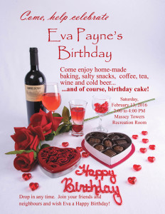
This doesn’t exactly match the size ratio of a 4×6” machine print, which is what I use to create individual invites for the residents. So, I create a second version with the text moved in about an inch on each side (2.5mm/6 pica). This can involve just moving the text box over, or it may involve adjusting the font size as well. I take the modified version to Costco for the machine prints and I crop on their machines for the nicest look.It is important to tell them not to do any colour correction or you will get results that are different from what you expect. I print the poster and the 8x10s (actually 8 1/2 x 11) on my trusty Epson 3880 printer.
The menu
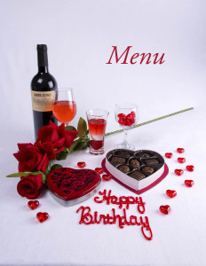
The menus are printed on 11×17” card stock and folded into an 8 1/2 x 11” booklet. The base image and the word “Menu” at an attractive spot forms the cover. The two pages inside are a large print menu of all of the desserts on the table, as well as the list of drinks available. Nothing is on the back.
Table cards
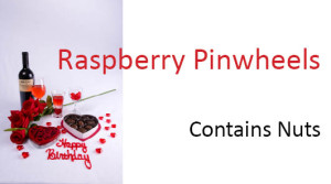
The table cards identifying the foods on the buffet table are laid out in MS Word because I haven’t gotten around to building an InDesign template for them. It’s basically a business card template. The base image is used with no lettering, on the left side of the card, and the rest is left white except for the name of the dessert and the “Contains” warning.
So, that’s how I make a multi-use image for posters, invitations, table cards, and menus. Not a lot of fuss, and not a lot of muss – unless I pour Gaterade on my backdrop.
This blog is published every Monday at 9:00 am, Eastern Standard Time. If you have comments, questions, or can think of a better approach, feel free to leave a comment. I’ll try to get back to you with a pithy answer.
Feel free to explore the rest of the Artifact Photography (a division of 1350286 Ontario Inc.) website at www.artifactphoto.ca
