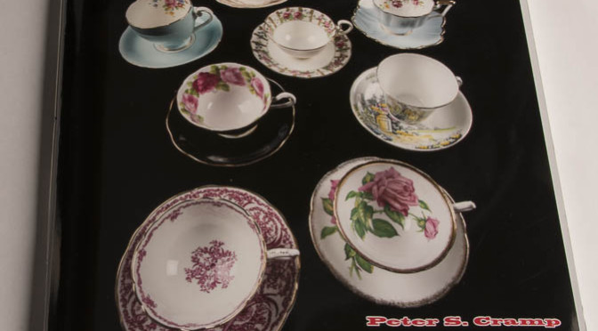
Have you ever noticed one day that rather than one or two bits of clutter, you actually have a collection? My wife and I noticed this one fine day, when we were clearing out some rarely used cupboards, trying to make room for more stuff. We found that, without any real effort, we’d acquired a collection of over 25 cups and saucers that didn’t match any particular set, although there were duplicates. They’re pretty. And since we’re planning to put a tea on at the local community centre, it made sense to record them so we can get them back. That, and I need items for my portfolio. The idea of the teacup collection catalog was born.
Before you just jump in and take a bunch of pictures, it really is worthwhile to do a bit of planning. There are logistics to work out, unless you want to work really long and hard and never get done. It is best to have a good idea of what you want to have at the end. I figured I wanted a book with pictures pretty much at actual size of:
- The cup and saucer together as they would look if you were about to use them (the money shot)
- The cup, top and bottom
- A closeup of any noteworthy detail(s) inside the cup
- The rear of the cup, if it was different from the front
- The saucer, top and bottom
- A closeup of the maker’s mark
Given that, what information do I want to record about each pair?
- I needed some kind of identifier, so I came up with Artifact Number. More on that later.
- Type: What kind of object is it? Cup, or saucer?
- Height: From tabletop to rim (exclusive of handle)
- Diameter: From edge to edge (exclusive of handle)
- Description: What are the primary features of this set?
- Company: Who made it?
- Trade name: After a little research I found the company name may be different from the name on the maker’s mark.
- Pattern (if known)
- Country of manufacture
- Town (if known)
- Area: region the town is located in
- Grade: some cups are “Bone China”, others “Fine Grade China” – Since I don’t quite know what they mean, I thought I should write it down for future reference.
- Msc: Anything else written on the set, or the condition, if less than perfect.
- Company in Operation: When was the company going (to give a hint as to vintage of the set)?
- Reference: Where did I get the information?
And how should I group them? Colour? Shape? Vintage? Manufacturer? I settled fairly quickly on manufacturer, as I’m not expert enough to use any other meaningful attribute.
Now that I knew what I was looking for, I could build a spreadsheet to record the information as I photographed the pieces.
But first, I needed some means of identifying each piece as I shot it. I numbered cards sequentially, and in each of the overhead shots, I included the number. It was cropped out of the completed work. By the time I got to the money shots, I knew each piece quite well, and because I always shot in the same order, it was easy to match them back up to their numbers. I’ll cover the shooting of each piece in my April 18, 2016 blog.
To layout the book, I use Adobe InDesign. It’s a desktop publishing program which lets me build books quickly and flexibly. I have used Microsoft Word, and, regrettably, Microsoft Excel to create books, but I like the simplicity and repeat-ability a good desktop publishing software gives me.
Because this is a book that will be used for a variety of purposes, including a part of my portfolio, I created it with all of the components a published book should have, except a ISBN number and library catalog entry.
It has:
- A cover
- A title page
- A copyright page
- A table of contents
- An introduction
- The actual content (the catalog)
- A rear cover
A great reference for designing a book is:
Ellen Lupton, Indie Publishing: How to Design and Produce Your Own Book. NewYork, NY. Princeton Architectural Press, 2008.
For the actual content, the catalog itself, I wanted the pictures to be near life-sized. This meant that I needed to create the book in a full size format, likely about 8 1/2″ x 11″ because that’s pretty normal. I wanted each spread (that’s what you call two facing pages) to represent one cup and saucer set. The first page is for the cup, and the second is for the saucer. This gives me a nice constraint. I don’t want it to extend beyond one spread and I don’t want it to be less than one spread. In the one case where I have cup but no saucer, I would need to take an additional glamour photo to make content for the facing page.
When I started out, I’d planned to print the book on my own printer and bind it myself, but I was at my local Staples buying paper when the dude behind the counter said, “you know we can do that way cheaper, don’t you?” So I went home, did a little calculating and decided they should print the content, but I’ll print the cover. I decided that the cover would look best on photographic paper, but as photographic paper can scratch easily, I’ll want to replace the cover fairly regularly. This lead my decision to go with a straight saddle stitched binding.
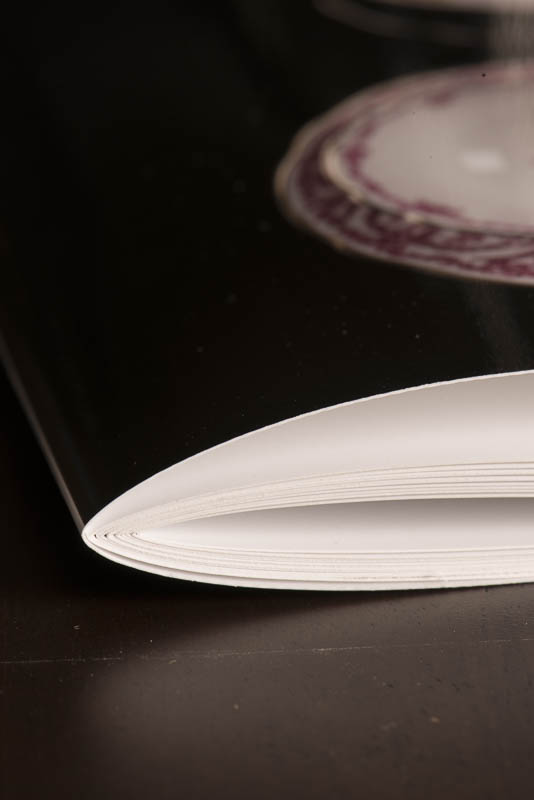
I don’t want to go into a treatise on book binding here, but basically, saddle stitching is where you print the book as four pages per sheet (front and back), fold them, and staple them together at the middle. At eleven sheets per signature (that’s what you call each set of pages folded together) it’s kind of thick for a saddle stitch, but because I’m sewing it together instead of the usual wire staple, I can easily take it apart and put a new cover on in about 5-10 minutes.
Because there are four pages per sheet, the total number of pages in your book must be divisible by four. In this case, there are eleven sheets with four pages per sheet, so 44 pages. Including the front matter (that’s the title page through table of contents), my book comes in at 43 pages, so I made the last page blank. But of course, I didn’t know this to start, and you only need to figure it out toward the end of the production. That’s when you either come up with more content or chose to pad with a blank page or two.
In the next two blogs, I will be discussing the cover shot for the catalog and then the process of photographing the individual sets.
This blog is published every Monday at 9:00 am, Eastern Standard Time. If you have comments, questions, or can think of a better approach, feel free to leave a comment. I’ll try to get back to you with a pithy answer.
Feel free to explore the rest of the Artifact Photography (a division of 1350286 Ontario Inc.) website at www.artifactphoto.ca